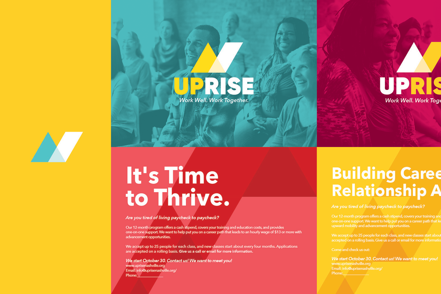

UpRise is a non-profit based in Nashville, TN that is working to love their neighbors - located on the Highway 40 corridor - by empowering residents in the area to acquire knowledge, skills, mentorship, and the resources to become economically self-sufficient through the power of relationship and the gospel of Jesus Christ.
Carole Peterson, Director at UpRise, approached me with the need to design their branding. They were just getting off the ground and wanted a solid aesthetic that would be useful in creating legitimacy as well as a feeling of community.
After doing some initial ideation and research, I became hooked on this idea of “building something together”. I kept seeing simple shapes, building blocks really, being stacked on top of each other. I wanted all kinds of shapes and colors to come together to make something better than the individual piece.
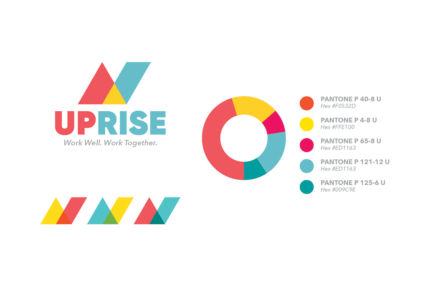
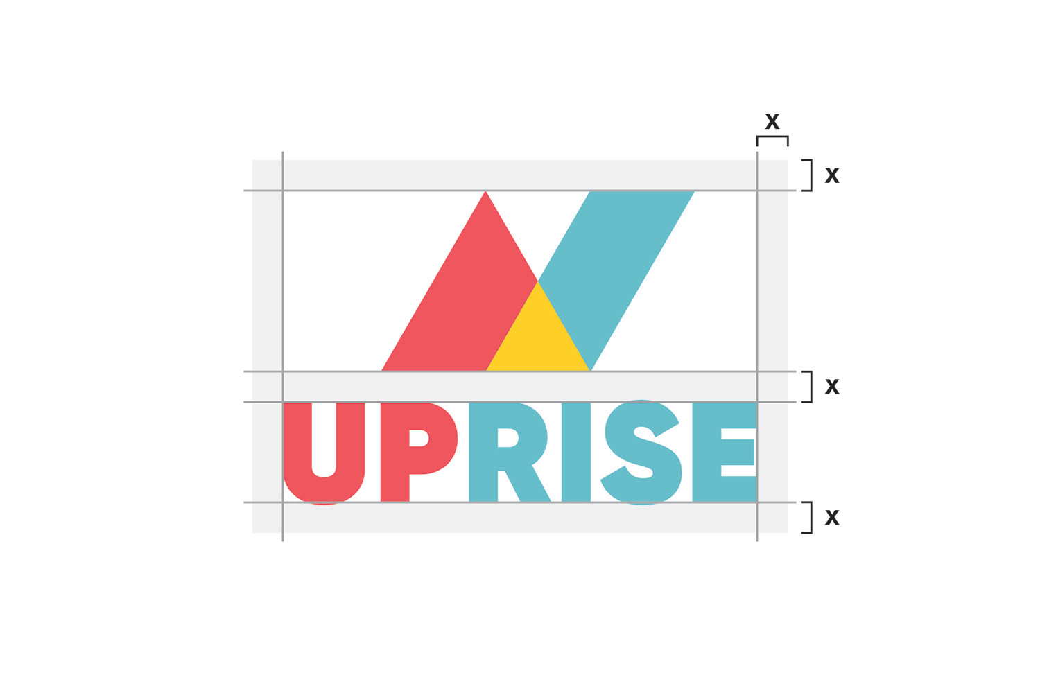
And so, I built the primary from a triangle pointing up, and a slash indicating a rise. These two marks come together, because they need each other to be successful, just like the partnership between Leaders, Allies, and Donors.
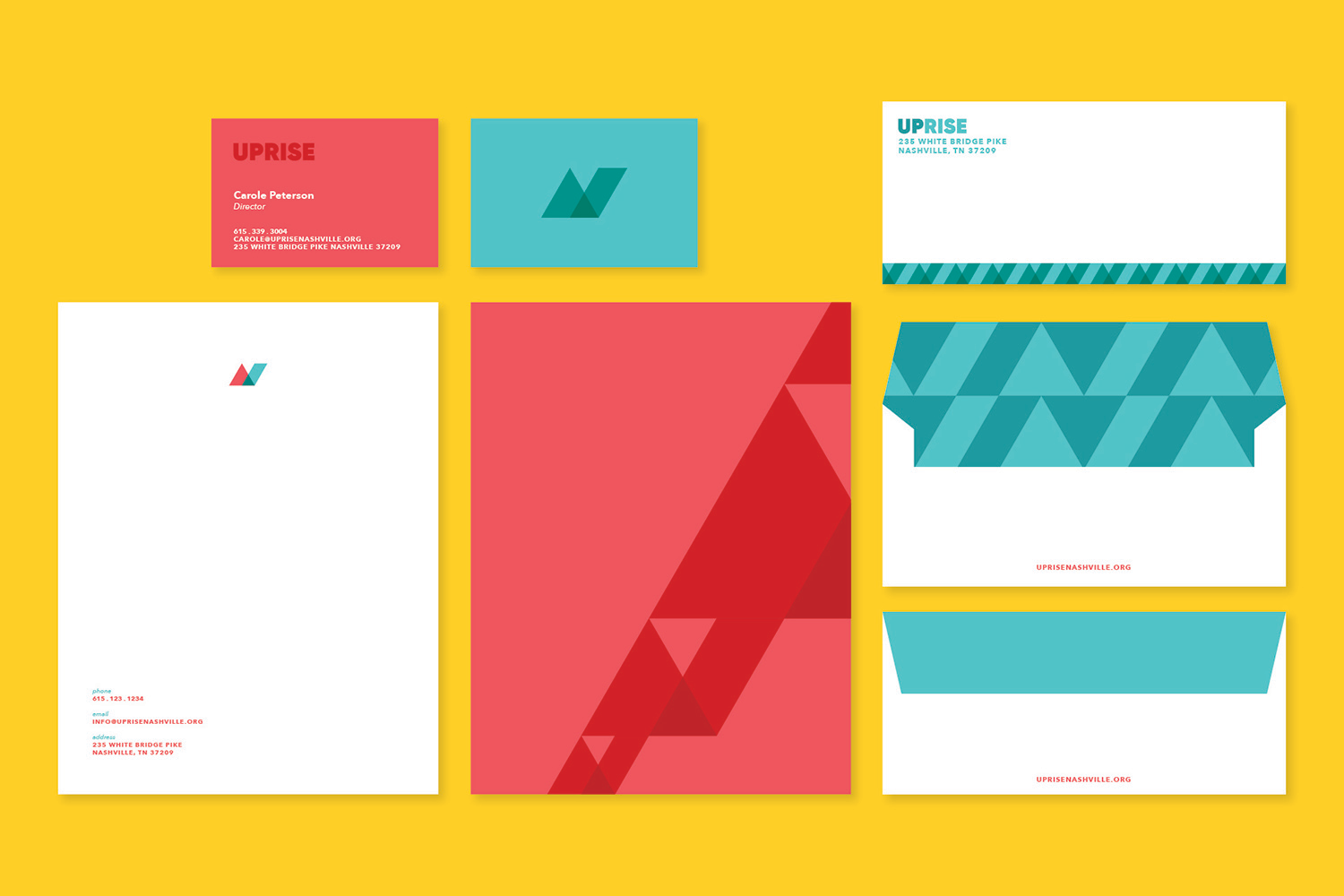
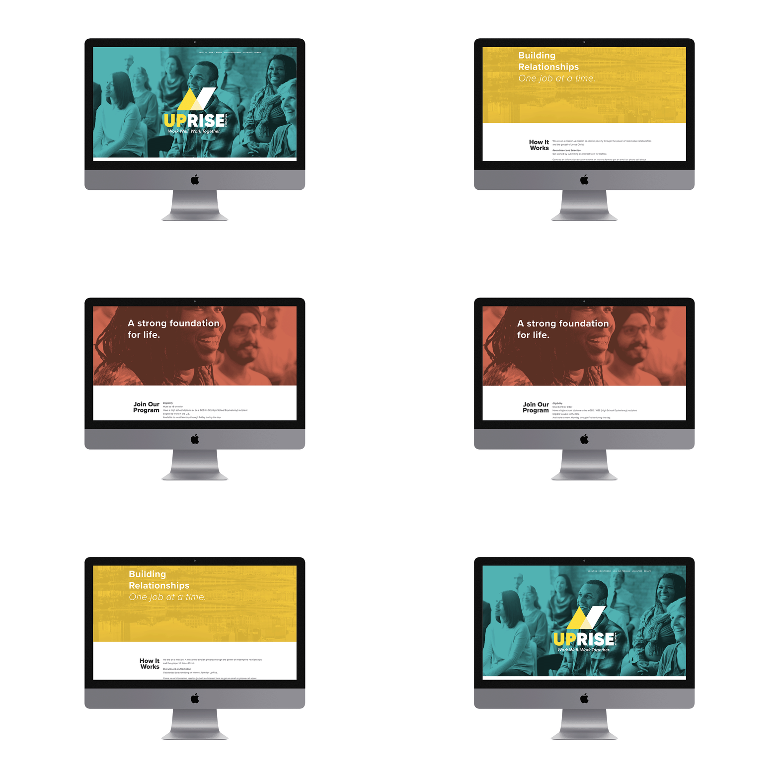
I built out the branding and executed it across various needs they had, including: posters, postcards, business cards, a website design, and letterhead.
