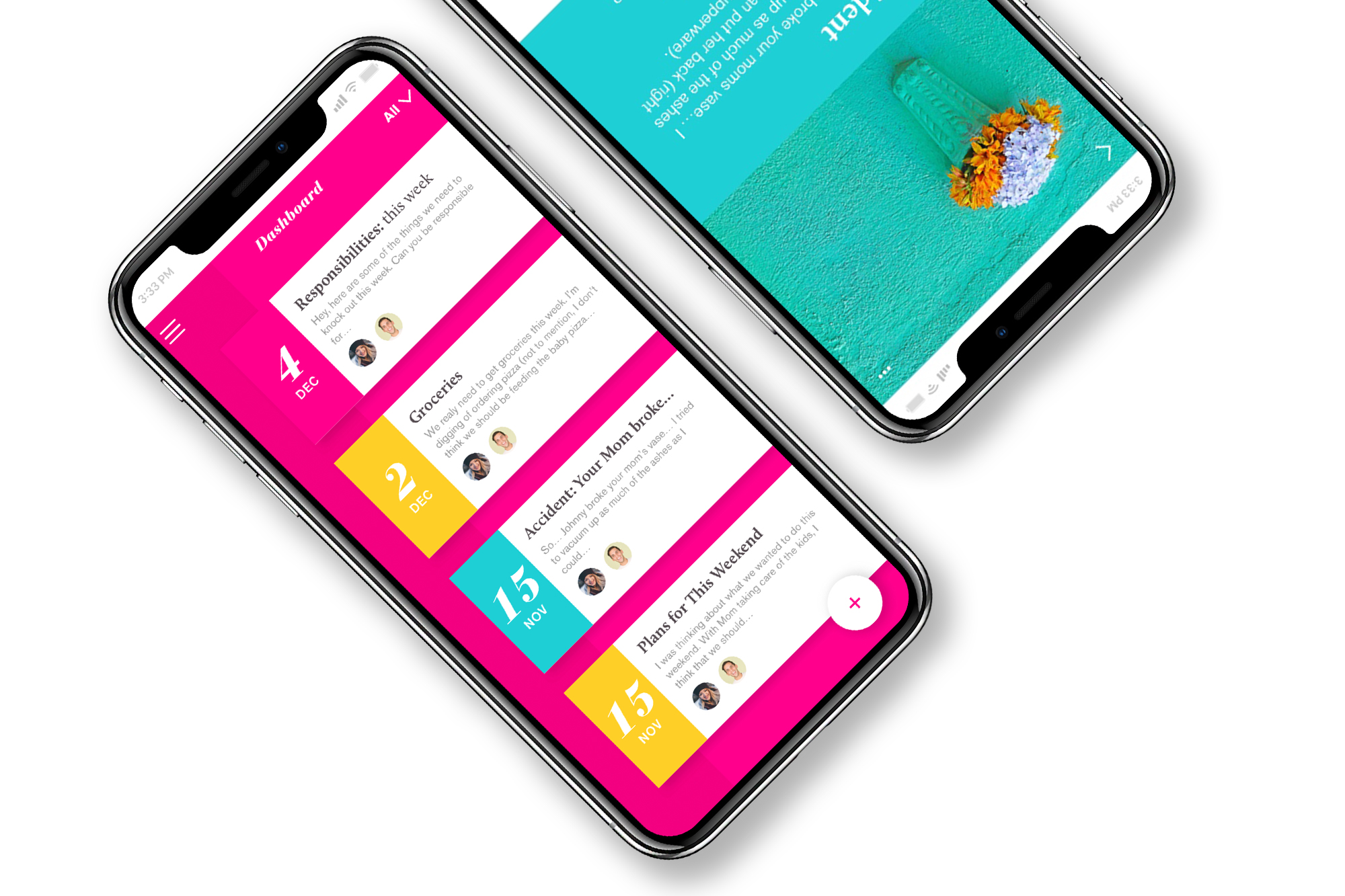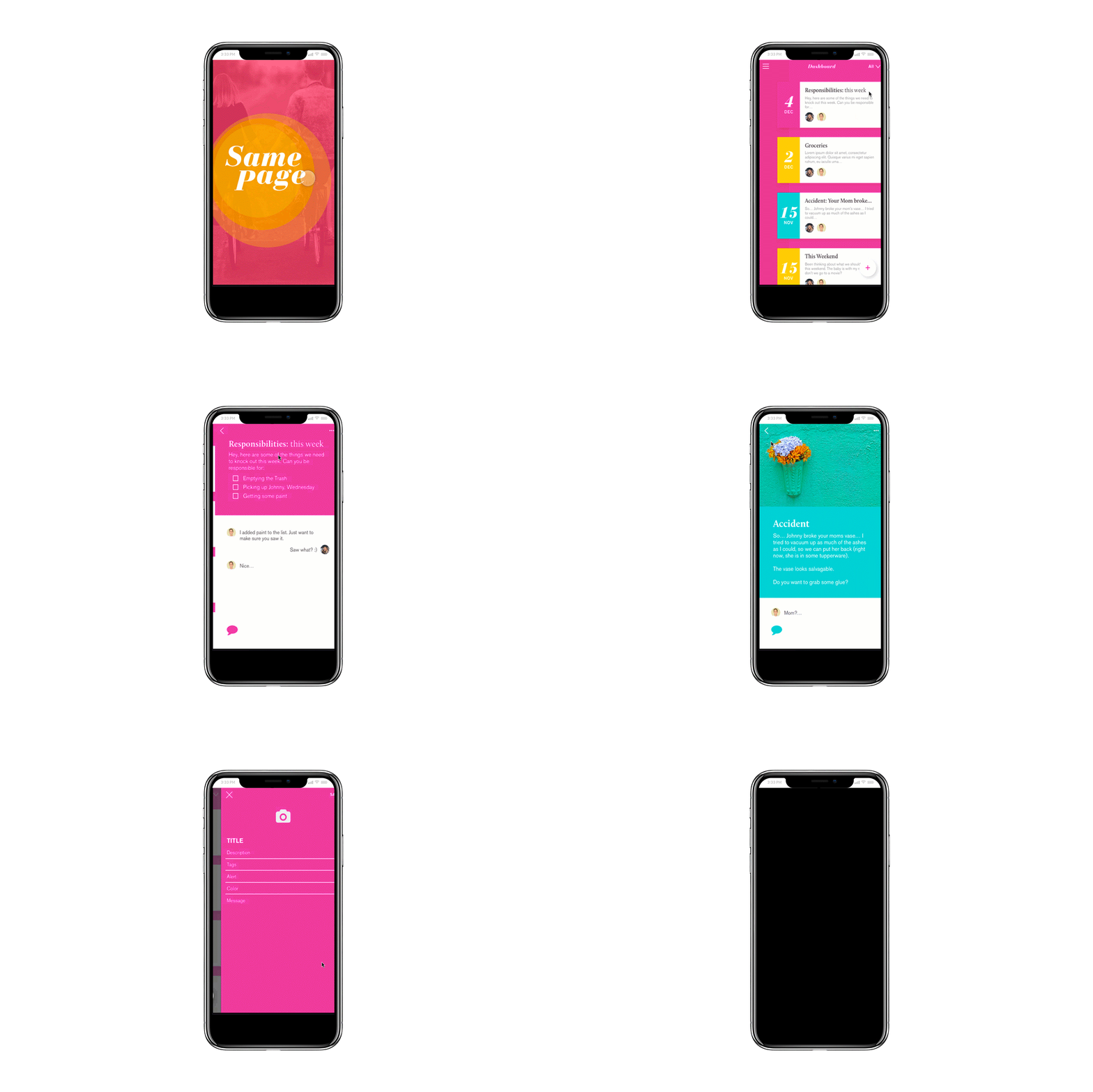


Same Page is a personal project I created in an attempt to solve a common source of conflict in my life: coordinating my family’s schedule. I have found it exceedingly difficult for my wife and me to stay in sync with our busy and widely varying schedules. In working toward a solution, I made the decision any logical designer would: I researched and designed a mobile application rather than having yet another scheduling pow wow with my wife.
I spoke with a number of couples, focusing mostly on young parents, to learn how they prefer to coordinate and collaborate with their significant other. I asked questions about tools they currently use, if any, and learned a great deal about both the processes they found most effective and areas they were consistently falling short with their communication.
Leveraging that information, I laid out an affinity map and worked to identify the core issues.
After laying out an affinity map, I translated that work into a clear assessment of the potential problems I would aim to solve and concepted a unique persona for an individual that Same Page would benefit.
With both my list of problems and a guiding user persona clearly defined, I built a User Flow that would dictate how best to structure the design for this application.
Prototyping and Usability TestingI began laying out the application with the intent to keep it simple and intuitive. The goal was to build an streamlined tool for effectively communicating with other people. Users with even minimal technological proficiency should be able to download the app and and quickly understand how to put it to full use.
This was my first round of sketches, which I quickly turned into paper mockups for testing. One of my first discoveries during testing was that I didn’t need as many content separations as I initially expected. I also quickly found that commenting on posts was overly complex and needed to be simplified.
More Prototyping and Usability TestingI revised my initial sketches and translated them to a medium fidelity mockup. I then incorporated those designs into InVision and began usability testing.
MVP DesignAfter incorporating the feedback form my usability testing, I built out high fidelity designs.

