

I was approached by the founders of MyLife, to build out their brand identity as well as develop the initial phase of their MVP application. MyLife is a financial life tool used to help the the average person make wise money decisions. If you're about to buy a house, want to have a baby, or are ready to take the plunge into entrepreneurship, MyLife is there for you, to help you evaluate and make the best decision possible
When you boil MyLife down, it's about freedom, the ability to lead your life the way you want to live. So, we wanted this brand to reflect that freedom. I played with ideas of breaking free, relieving burdens, a movement towards growth. Symbols of birds, broken chains, feathers, and plants (thought we wanted to stay away from plants since that is typical of financial brands).
I started by creating this chaotic pattern of linework. Then built different birds or paper airplanes from similar lines. I wanted to use these to communicate that idea of freedom and weathering the storms of life.
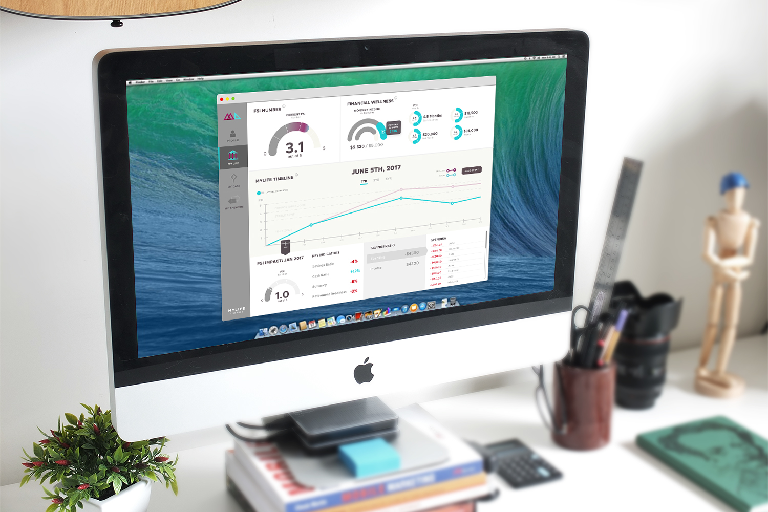
After completing the brand, I worked closely with MyLife to help them design their MVP. This would be the tool they would take to market, establish with a case study with users, and then take to investors to move forward.
Starting the ProjectI had already created a strong foundation for the project by building their brand, so I knew what I was working with. We were already well acquainted with each other, and knew our primary objectives: Translate the current working Excel Prototype to an MVP App Communicate the meaning and value of a user’s Financial Stability Indicator Demonstrate where the FSI comes from and its importance Identify and validate assumed Key Users
Research and PrototypingThe only things MyLife had was a number crunching prototype in Excel. Lots of data, lots of detail, very little direction in terms of the most important pieces of information. I me with their team for over three hours trying to isolate the key pieces of information that we needs to communicate our objectives. Obviously, we wanted focused on the Financial Stability Indicator, so that took forefront. And then we supported that by pulling additional data for the FSI.
A big issue was trying to design a way for the user to visualize the changes in their FSI over time. We played with two ideas for solving this:
The obvious answer was to use a timeline and allow the user to interact with that timeline.
We designed a bubble chart system that would break down a user’s FSI into various parts, and the use could get as detailed as he wanted.
We white boarded all these ideas together with MyLife, and then got to work.
PrototypingI put together lofi mockups that we used for simple usability testing.
User TestingWhile testing the prototypes, we found that the Bubble Chart system, while really cool, did not correlate with time as much as the simpler timelines. Uses thought that the depth of detail was cool, but it was more difficult for them to associate time changes, or see those time changes over time.
So, we tabled the bubble chart and moved forward with the Timeline Feature.
Detailed design & Usability TestingWith the mood board, research, initial mockups, and testing results in hand, I began designing high fidelity mockups to use for more User Testing.
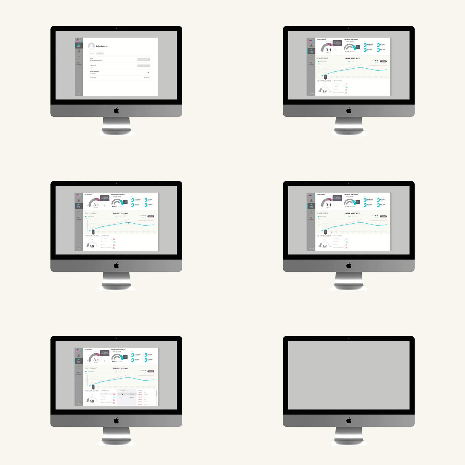
User TestingWe created high fidelity prototypes using InVision, and sent these prototypes to various users for testing. We received a lot of feedback, primarily on the fact that a lot of internal language is used in the application, and is left unexplained in the dashboard (especially FSI). While a lot of the language and new terminology would be discussed during the signup wizard, we wanted to make sure that a user coming back to the app didn’t forget anything they learned. So, we redesigned the dashboard and incorporated a tutorial help widget that would explain things to the user.
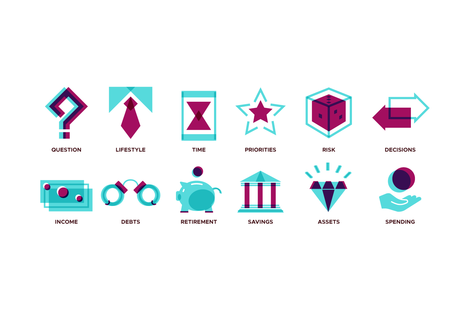
Creating SpecificationWhen designs have were finalized, I built out a UI kit for the developer. I usually create animations for the interactions as they can be used for showing great things to the clients, but it’s also a helpful asset for the developers.
"We really appreciated the structure that Trip brought to the entire design process. In the branding phase we liked the quality and depth of the deliverables and enjoyed the steps we took to get there. Ink & Iron went above and beyond our expectations and what was outlined in our initial proposal." - Trey Poteet, founder at MyLife Tool


