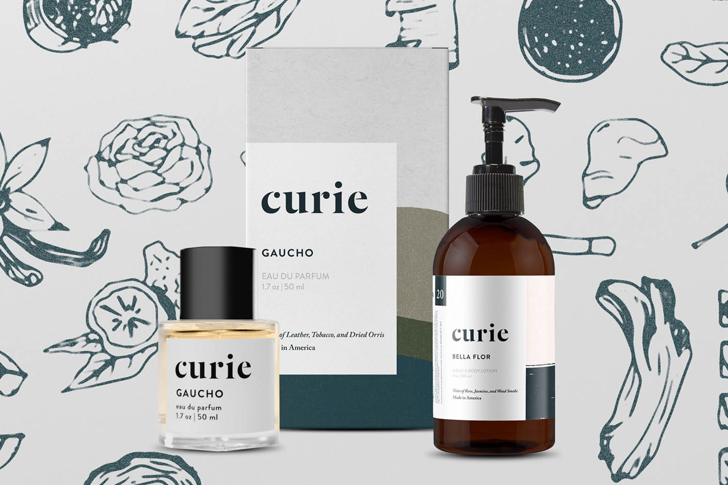


I was approached by Oliver Shuttlesworth, Founder at Esperos Bags to help him build the brand for his next venture, Curie, a fragrance and personal hygiene company. Curie is reinventing the way you discover and experience personal care products. No middlemen, no markup. Just premium grooming essentials made with honest ingredients, sold at honest prices.
I worked with Oliver to build a brand that reflected that innovation and character.
This isn’t always about knowing the specific market you’re building a brand in (although that definitely needs to happen). It’s about understanding how you want to connect to your customers.
In this case, we were working on a product that was going to change the way customers bought fragrances. So, we looked at companies who disrupted their perspective markets.
Understand CompetitorsThis part is very important. You need to know what kinds of aesthetics are trending in the marketplace currently, so that you can use that knowledge to your advantage. It’s your job as a designer to build something that is engaging, compelling, and distinct. That means making something different enough that it’s interesting, but close enough to the competitors that they understand where your product fits.
Developing Our HypothesisOur target customer was the millenial. They live life, pursue experiences, and travel the world. We wanted to build fragrances that would reflect that sense of adventure.
We knew that we wanted to build a fragrance brand that was based off of specific regions in North and South America. Therefore, we really wanted the brand to reflect those regions.
We also recognized that the climate of fragrance brands right now is very clean, scientific and elegant. Lots of crisp lines, white space, and high fashion photography. We really wanted to build a brand that separated itself by utilizing hand made artwork and textures based on the locations of our fragrances. We also wanted to create a visual tangibility to the fragrances by utilizing photography from the areas.
MoodboardsThis is where I started translating the research we had gathered and the ideas we were discussing into a visual aesthetic. I began collecting images, designs, artwork that I thought reflected this idea of place. This included old photographs of explorers, regions of the world we were thinking about basing fragrances on, and design work I felt was a good reflection of the character we wanted to create with the brand.
As we moved the conversation forward, I started looking at lots of textures and patterns. I was trying to figure out how to bring a unique human experience in addition to reflecting these locations.
Lots of SketchingI usually start my branding process just making stuff. I’ve been researching and writing a ton up to this point, so it’s time to do a little thinking with my hands. In this case, I was playing with a lot of textures, anticipating how I might utilize them later on.
IterationWe decided to utilize the last direction. So, I began iterating and building on. I created typographic hierarchies, played with decorative elements and ornamentation, and also tried to figure out how we might incorporate photography in a unique way.
Patterning and ColorsWe identified the specific colors we wanted to use for each fragrance family. I used these colors as I pressed forward designing unique patterns.
Fragrance IllustrationsI really wanted to create separation from the 5 fragrances we had created. So, I designed illustrations that would communicate the various scenes those fragrances had.
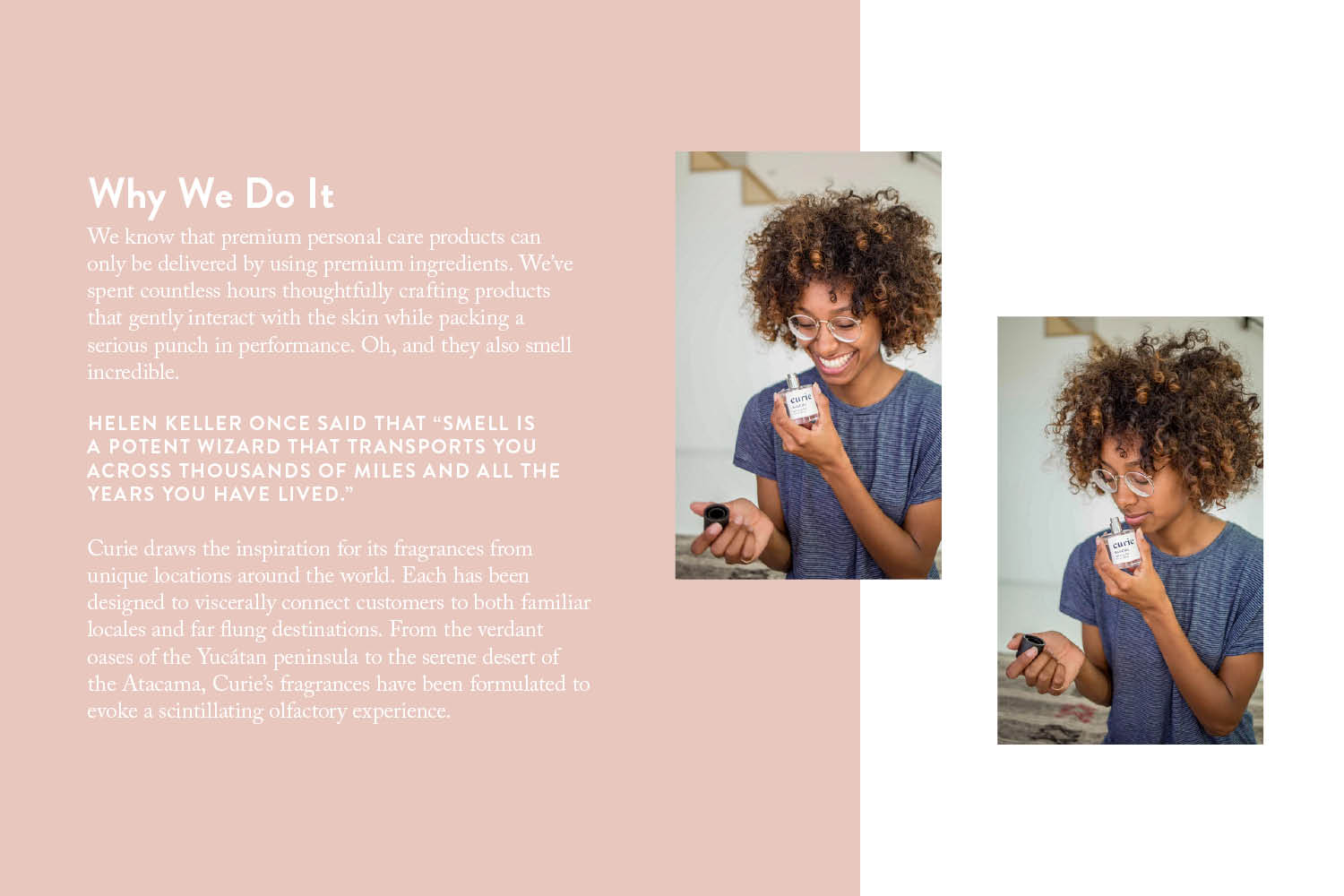
Guidelines DocSo, after building out typographic hierarchies, establishing colors, creating fragrance illustrations, and applying the branding to packaging, I took all the work we had created thus far and built a Brand Guidelines Document.

