In the world of boys fashion, there’s a significant lack of stylish, durable, and comfortable clothing options for boys in the 6-13 age range. Based on her own experiences shopping for her son, the client knew how frustrating trying to find clothes that get both moms’ and boys’ stamp of approval can be—so she decided to start a fashion line that meets this need.
What she needed was a strong name, branding, and a compelling narrative to tell her potential customers.
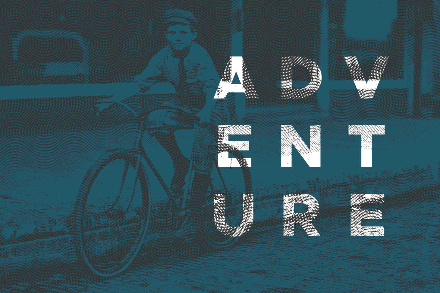
The process began with research that helped me understand the brand’s target audience. I identified competitors, the things they did well, and what our competitive advantage would be. These clothes were going to change how a boy lives. They were going to be able to go to church, then play football in the mud immediately afterwards. In a way, we were returning to the times of Tom Sawyer and Huckleberry Finn, before clothes were designed for athletics.
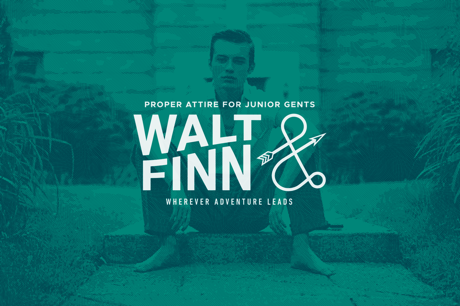
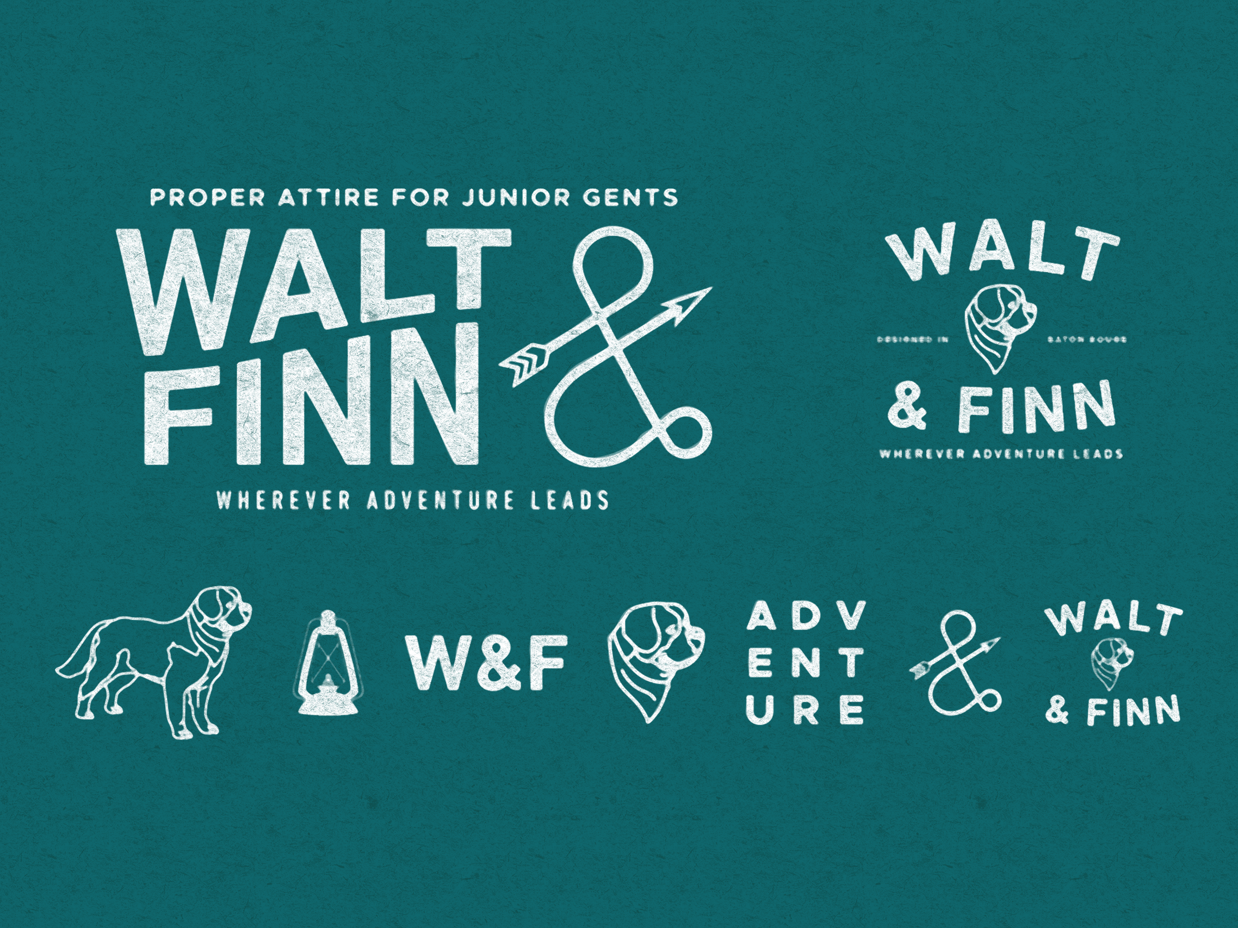
I used this idea of nostalgia, especially in connection to the client’s close association with the Mississipi. So, I created several dozen different name suggestions. I played with ideas like Old Blue, Great River, Riverboys, Meridian, Red Arch Outfitters; finally landing on Walt & Finn, because it captured the nostalgic vision of boyhood—full of adventure, risk, and discovery.
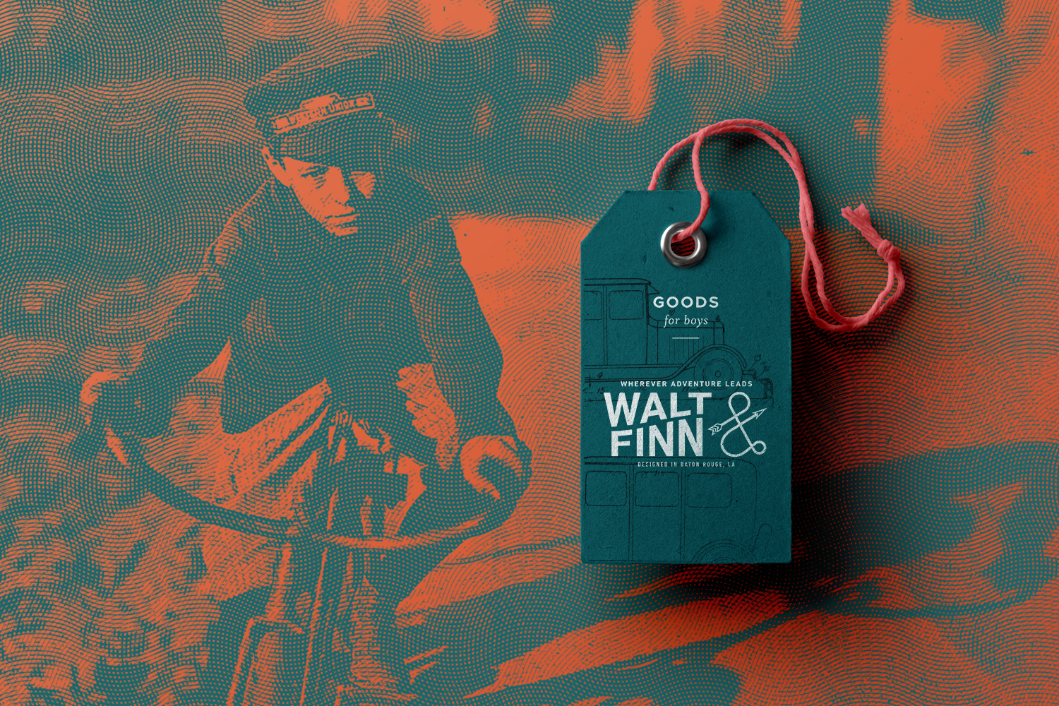
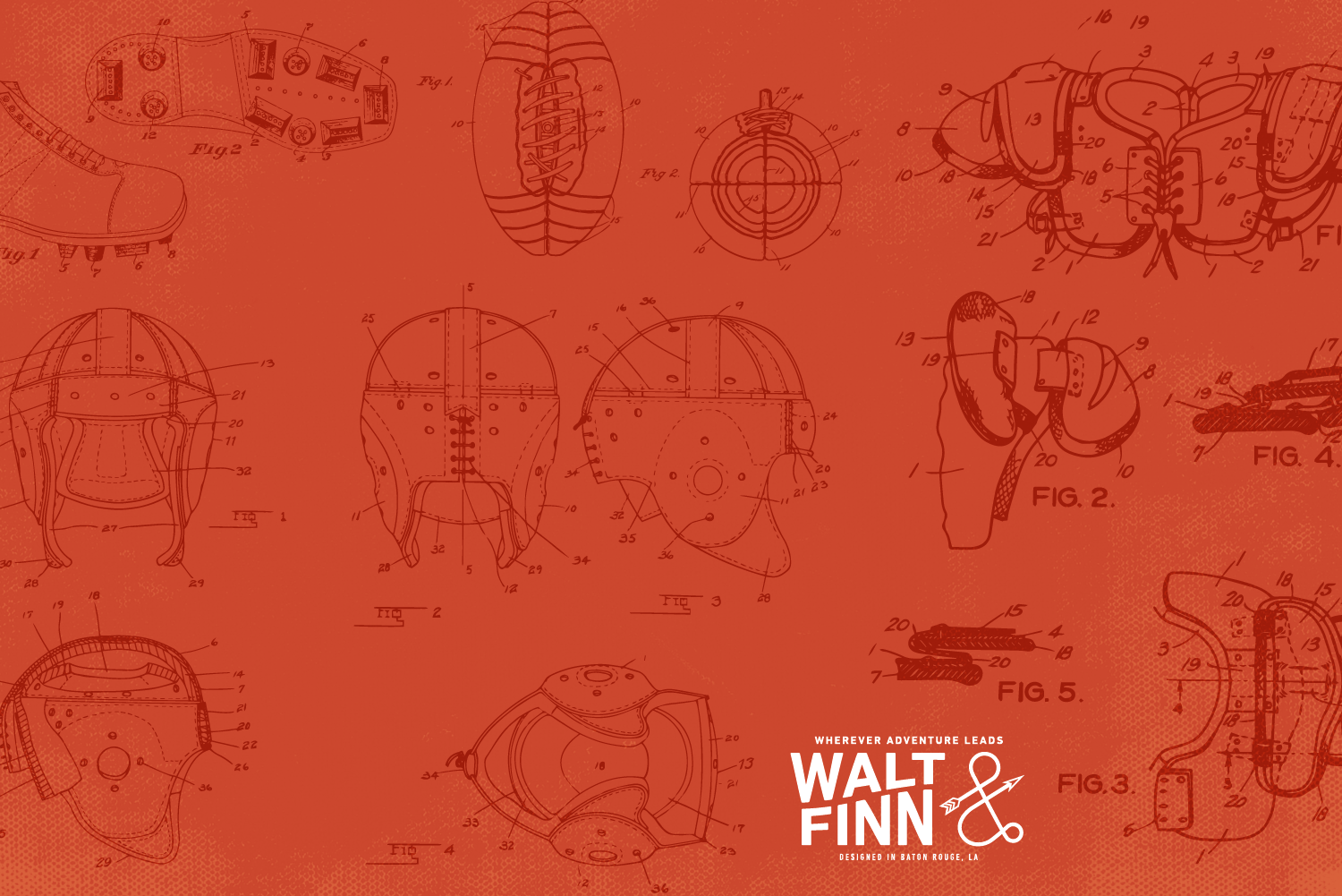
To connect today’s styles and this timeless narrative, I created a visual language that paired modern typography and color palettes with old school photography and vintage illustrations.
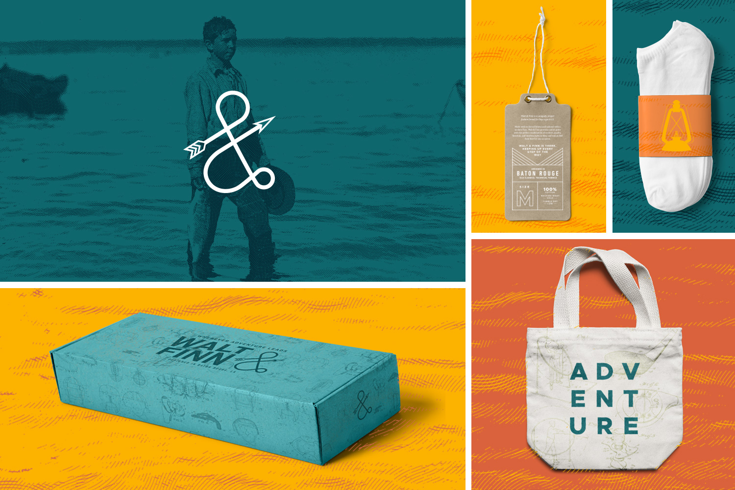
Using the identity I built, I designed packaging, collateral, as well as a landing page, and digital ads to be used in Walt & Finn's initial launch.